- Resource Library
- Math
- Data And Graphing
- Histogram Interpretation
- Understanding Histograms And Bar Graphs
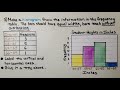
Understanding Histograms and Bar Graphs
Interactive Video
•
Mathematics
•
6th - 7th Grade
•
Practice Problem
•
Medium

Thomas White
Used 1+ times
FREE Resource
Read more
10 questions
Show all answers
1.
MULTIPLE CHOICE QUESTION
30 sec • 1 pt
What is the primary purpose of a histogram?
To display the frequency of data within intervals
To show the total number of data points
To compare two different data sets
To list data in alphabetical order
2.
MULTIPLE CHOICE QUESTION
30 sec • 1 pt
In a histogram, what does the height of each bar represent?
The total number of data points
The frequency of data within that interval
The average value of the data
The sum of all data points
3.
MULTIPLE CHOICE QUESTION
30 sec • 1 pt
How are intervals used in creating a frequency table?
They determine the color of the bars in a histogram
They are used to calculate the average
They help in dividing data into equal parts
They are used to sort data alphabetically
4.
MULTIPLE CHOICE QUESTION
30 sec • 1 pt
Why is it important for the bars in a histogram to have equal widths?
To ensure the histogram is colorful
To maintain consistency in data representation
To make the histogram look symmetrical
To allow for easier comparison with bar graphs
5.
MULTIPLE CHOICE QUESTION
30 sec • 1 pt
What happens to a histogram when new data points are added within an existing interval?
A new interval is created
The histogram remains unchanged
The bar height for that interval increases
The bar width for that interval increases
6.
MULTIPLE CHOICE QUESTION
30 sec • 1 pt
What should be done if a new data point falls outside the existing intervals in a histogram?
Increase the height of the nearest bar
Ignore the data point
Add a new bar with a new interval
Decrease the width of the existing bars
7.
MULTIPLE CHOICE QUESTION
30 sec • 1 pt
How does a frequency table differ from a histogram?
A frequency table is always more accurate
A frequency table uses colors to represent data
A frequency table shows data in intervals
A frequency table lists frequency as numbers in columns
Access all questions and much more by creating a free account
Create resources
Host any resource
Get auto-graded reports
Continue with Google

Continue with Email
Continue with Classlink
Continue with Clever
or continue with
Microsoft
%20(1).png)
Apple
Others
Already have an account?
