Statistics and Data Representation Concepts
Interactive Video
•
Mathematics
•
9th - 10th Grade
•
Hard

Thomas White
FREE Resource
Read more
11 questions
Show all answers
1.
MULTIPLE CHOICE QUESTION
30 sec • 1 pt
Why is a graph considered a powerful tool in statistics?
It simplifies data into a single value.
It offers a visual representation that can convey complex data patterns.
It eliminates the need for calculations.
It provides a detailed numerical analysis.
2.
MULTIPLE CHOICE QUESTION
30 sec • 1 pt
Which of the following is NOT a method for displaying numerical data distributions?
Pie chart
Box plot
Dot plot
Histogram
3.
MULTIPLE CHOICE QUESTION
30 sec • 1 pt
In a dot plot, how is the frequency of data values represented?
By the width of the plot
By the color of dots
By the number of dots stacked
By the height of bars
4.
MULTIPLE CHOICE QUESTION
30 sec • 1 pt
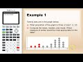
What is the proportion of data points that are three or less in the given dot plot example?
1/3
1/5
1/2
1/4
5.
MULTIPLE CHOICE QUESTION
30 sec • 1 pt
How do you calculate the mean from a dot plot?
By finding the middle value
By subtracting the smallest value from the largest
By adding all values and dividing by the number of values
By identifying the most frequent value
6.
MULTIPLE CHOICE QUESTION
30 sec • 1 pt
What is the median in the given dot plot example?
8
9
7
6
7.
MULTIPLE CHOICE QUESTION
30 sec • 1 pt
Which measure is most appropriate for skewed data?
Mode
Mean
Range
Median
Access all questions and much more by creating a free account
Create resources
Host any resource
Get auto-graded reports
Continue with Google

Continue with Email
Continue with Classlink
Continue with Clever
or continue with
Microsoft
%20(1).png)
Apple
Others
Already have an account?
