
Lesson on Scatter Plots
Presentation
•
Mathematics
•
8th Grade
•
Practice Problem
•
Medium
+4
Standards-aligned

Kerri Smith
Used 119+ times
FREE Resource
7 Slides • 8 Questions
1
Lesson on Scatter Plots

2
3
Positive Correlation
As x increases, y increases. Looking at this graph...the older you are, the more money you will make.

4
Types of Positive Correlation
Strong Positive or Weak Positive

5
Negative Correlaton
As x increases, y decreases. Example...when I run(exercise) 2 km/wk my weight is about 88 kg. (2, 88) When I run(exercise) 5 km/wk my weight is about 84.5 (5, 84.5)

6
No Correlation
When the two inputs have no correlation, no effect on each other, it is said to have no correlation. There is no relationship between the two sets of input.

7
Types of Negative Correlations
Strong, Weak , and Perfect

8
Multiple Choice

Based on the graph, if Joe earned $400, how many hours did he work?
9
Multiple Choice

Mrs. Collins made a scatterplot to show the relationship between the number of absences and a student’s final exam score. Based on this scatterplot, a student with 6 absences should get approximately what score on the final exam?
10
Multiple Choice

The scatter plot shows the relationship between the number of chapters and the total number of pages for several books. Use the trend line to predict how many pages would be in a book with 19 chapters.
11
Multiple Choice

What type of correlation does this scatter plot show?
12
Multiple Choice

Which sentence describes the relationship shown on this scatter plot?
13
Multiple Choice
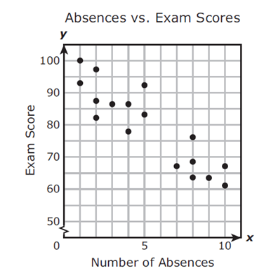
Mrs. Collins made a scatterplot to show the relationship between the number of absences and a student’s final exam score. Based on this scatterplot, a student with 12 absences should get approximately what score on the final exam?
14
Multiple Choice

What type of correlation does this graph have?
15
Multiple Choice

What type of correlation does this graph have?
Lesson on Scatter Plots
Show answer
Auto Play
Slide 1 / 15
SLIDE
Similar Resources on Wayground

11 questions
Repeating Decimals as Fractions
Lesson
•
8th Grade
11 questions
Perfect Squares and Square Roots
Lesson
•
8th Grade
11 questions
Analyzing Graphs
Lesson
•
8th Grade
11 questions
Dialation
Lesson
•
8th Grade
12 questions
Graphing/Functions
Lesson
•
8th Grade
9 questions
Volume- Sphere, Cone, Cylinder
Lesson
•
8th Grade
11 questions
Zero and Negative Exponents
Lesson
•
8th Grade
11 questions
Factoring General Trinomials
Lesson
•
8th Grade
Popular Resources on Wayground
8 questions
Spartan Way - Classroom Responsible
Quiz
•
9th - 12th Grade
15 questions
Fractions on a Number Line
Quiz
•
3rd Grade
14 questions
Boundaries & Healthy Relationships
Lesson
•
6th - 8th Grade
20 questions
Equivalent Fractions
Quiz
•
3rd Grade
3 questions
Integrity and Your Health
Lesson
•
6th - 8th Grade
25 questions
Multiplication Facts
Quiz
•
5th Grade
9 questions
FOREST Perception
Lesson
•
KG
20 questions
Main Idea and Details
Quiz
•
5th Grade
Discover more resources for Mathematics
20 questions
Scatter Plots and Line of Best Fit
Quiz
•
8th Grade
12 questions
8th U6 L4 - Fitting a Line to Data
Quiz
•
8th Grade
25 questions
Scatter Plots and Line of Best Fit
Quiz
•
8th Grade
14 questions
finding slope from a graph
Quiz
•
8th Grade
20 questions
Graphing Inequalities on a Number Line
Quiz
•
6th - 9th Grade
20 questions
Pythagorean Theorem Review
Quiz
•
8th Grade
20 questions
Laws of Exponents
Quiz
•
8th Grade
20 questions
Slope from a Graph
Quiz
•
8th Grade