Analyzing Scatter Plots and Relationships
Interactive Video
•
Mathematics
•
6th - 7th Grade
•
Practice Problem
•
Hard

Patricia Brown
FREE Resource
Read more
10 questions
Show all answers
1.
MULTIPLE CHOICE QUESTION
30 sec • 1 pt
What is a scatter plot used for?
To calculate averages
To compare multiple categories
To display a single variable over time
To show the relationship between two variables
2.
MULTIPLE CHOICE QUESTION
30 sec • 1 pt
In a positive relationship on a scatter plot, what happens to the y-variable as the x-variable increases?
The y-variable decreases
The y-variable remains constant
The y-variable increases
The y-variable fluctuates randomly
3.
MULTIPLE CHOICE QUESTION
30 sec • 1 pt
What type of relationship is indicated by a scatter plot where data points are scattered without any clear pattern?
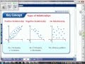
Positive relationship
Negative relationship
No relationship
Cyclic relationship
4.
MULTIPLE CHOICE QUESTION
30 sec • 1 pt
How can relationships in scatter plots be useful?
They help in making predictions about future data points
They determine the exact future values
They eliminate the need for further data collection
They provide exact solutions to mathematical problems
5.
MULTIPLE CHOICE QUESTION
30 sec • 1 pt
What should you do first when analyzing a scatter plot for your homework?
Draw a line of best fit
Identify the type of relationship
Calculate the mean of the data
Ignore outliers
6.
MULTIPLE CHOICE QUESTION
30 sec • 1 pt
When graphing data, why is it important to choose good intervals?
To reduce the number of data points
To make the graph more complex
To ensure the graph is easy to read and interpret
To make the graph look more colorful
7.
MULTIPLE CHOICE QUESTION
30 sec • 1 pt
What is a key consideration when selecting a scale for the y-axis in a scatter plot?
The scale should be based on the x-axis
The scale should be the same as the x-axis
The scale should be as large as possible
The scale should cover the range of the data
Access all questions and much more by creating a free account
Create resources
Host any resource
Get auto-graded reports
Continue with Google

Continue with Email
Continue with Classlink
Continue with Clever
or continue with
Microsoft
%20(1).png)
Apple
Others
Already have an account?
