Understanding Histograms and Data Representation
Interactive Video
•
Mathematics
•
6th - 7th Grade
•
Practice Problem
•
Hard

Thomas White
FREE Resource
Read more
10 questions
Show all answers
1.
MULTIPLE CHOICE QUESTION
30 sec • 1 pt
What is the primary purpose of using a histogram?
To calculate the mean of a dataset
To compare two different datasets
To show the distribution of data
To display exact data points
2.
MULTIPLE CHOICE QUESTION
30 sec • 1 pt
How are data values grouped in a histogram?
By individual data points
By categories
By colors
By bins
3.
MULTIPLE CHOICE QUESTION
30 sec • 1 pt
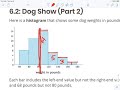
In the dog weights example, what does each bar in the histogram represent?
A single dog's weight
The average weight of all dogs
The heaviest dog's weight
A range of weights
4.
MULTIPLE CHOICE QUESTION
30 sec • 1 pt
How many dogs weigh at least 100 pounds according to the histogram?
25
20
23
18
5.
MULTIPLE CHOICE QUESTION
30 sec • 1 pt
Why can't we determine the exact number of dogs weighing 70 pounds from the histogram?
The histogram does not show any data
The histogram only shows average weights
The histogram is not detailed enough
The histogram groups data into bins
6.
MULTIPLE CHOICE QUESTION
30 sec • 1 pt
What is the estimated typical weight of a dog at the show?
80 pounds
110 pounds
100 pounds
90 pounds
7.
MULTIPLE CHOICE QUESTION
30 sec • 1 pt
How does a dot plot differ from a histogram in terms of data representation?
It shows data in bins
It provides exact data points
It uses bars to represent data
It is less precise than a histogram
Access all questions and much more by creating a free account
Create resources
Host any resource
Get auto-graded reports
Continue with Google

Continue with Email
Continue with Classlink
Continue with Clever
or continue with
Microsoft
%20(1).png)
Apple
Others
Already have an account?
Popular Resources on Wayground

7 questions
History of Valentine's Day
Interactive video
•
4th Grade
15 questions
Fractions on a Number Line
Quiz
•
3rd Grade
20 questions
Equivalent Fractions
Quiz
•
3rd Grade
25 questions
Multiplication Facts
Quiz
•
5th Grade
22 questions
fractions
Quiz
•
3rd Grade
15 questions
Valentine's Day Trivia
Quiz
•
3rd Grade
20 questions
Main Idea and Details
Quiz
•
5th Grade
20 questions
Context Clues
Quiz
•
6th Grade
Discover more resources for Mathematics
20 questions
Writing Algebraic Expressions
Quiz
•
6th Grade
20 questions
Ratios/Rates and Unit Rates
Quiz
•
6th Grade
14 questions
Volume of rectangular prisms
Quiz
•
7th Grade
20 questions
Graphing Inequalities on a Number Line
Quiz
•
6th - 9th Grade
20 questions
One Step Equations
Quiz
•
6th Grade
10 questions
Solving One Step Inequalities
Quiz
•
6th Grade
15 questions
Equivalent Ratios
Quiz
•
6th Grade
16 questions
2022 Winter Olympics Medal Table
Passage
•
6th - 8th Grade