Analyzing Points on a Graph
Authored by Anthony Clark
Mathematics
8th Grade
CCSS covered

AI Actions
Add similar questions
Adjust reading levels
Convert to real-world scenario
Translate activity
More...
Content View
Student View
10 questions
Show all answers
1.
MULTIPLE CHOICE QUESTION
1 min • 1 pt

About how many male math teachers were there in 2006?
15
30
35
45
Tags
CCSS.HSF.IF.B.4
2.
MULTIPLE CHOICE QUESTION
1 min • 1 pt
What is a scatter plot?
A graph that shows the relationship of two data sets.
A graph drawn using rectangular bars to show how large each value is.
A graph that shows information that is connected in some way.
A graph that shows data changing over time.
3.
MULTIPLE CHOICE QUESTION
1 min • 1 pt

What type of correlation does this graph have?
positive
negative
none
all of the above
4.
MULTIPLE CHOICE QUESTION
1 min • 1 pt
What is a line of best fit used for?
To make predictions
To make the graph look pretty
To connect the points
To make it look like you know what you are doing
Tags
CCSS.8.EE.B.5
5.
MULTIPLE CHOICE QUESTION
1 min • 1 pt

The scatterplot below suggests which of the following types of data relationship?
Weak, negative
weak, positive
strong, negative
strong, positive
6.
MULTIPLE CHOICE QUESTION
1 min • 1 pt

Based on the graph, if Joe earned $400, how many hours did he work?
25 hours
35 hours
45 hours
15 hours
Tags
CCSS.HSF.IF.A.2
7.
MULTIPLE CHOICE QUESTION
1 min • 1 pt
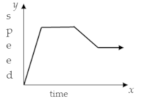
As x increases, y increases shows ........
correlation coefficient
causation
positive association
negative association


Access all questions and much more by creating a free account
Create resources
Host any resource
Get auto-graded reports
Continue with Google

Continue with Email
Continue with Classlink
Continue with Clever
or continue with
Microsoft
%20(1).png)
Apple
Others
Already have an account?
Similar Resources on Wayground

15 questions
Coordinate Plane and Slope of a Line
Quiz
•
8th Grade
12 questions
Number Set
Quiz
•
8th - 12th Grade
12 questions
Unit 7 Multiplication and Division Review
Quiz
•
3rd Grade - University
10 questions
Rational vs. Irrational Numbers
Quiz
•
8th - 12th Grade
10 questions
Sports Math
Quiz
•
7th - 8th Grade
13 questions
Paint Cards - Ratios Task
Quiz
•
6th - 9th Grade
10 questions
Volume of Prisms and Cylinders
Quiz
•
8th Grade
10 questions
Indices and Logarithms
Quiz
•
8th Grade
Popular Resources on Wayground
15 questions
Fractions on a Number Line
Quiz
•
3rd Grade
20 questions
Equivalent Fractions
Quiz
•
3rd Grade
25 questions
Multiplication Facts
Quiz
•
5th Grade
54 questions
Analyzing Line Graphs & Tables
Quiz
•
4th Grade
22 questions
fractions
Quiz
•
3rd Grade
20 questions
Main Idea and Details
Quiz
•
5th Grade
20 questions
Context Clues
Quiz
•
6th Grade
15 questions
Equivalent Fractions
Quiz
•
4th Grade
Discover more resources for Mathematics
14 questions
finding slope from a graph
Quiz
•
8th Grade
20 questions
Laws of Exponents
Quiz
•
8th Grade
12 questions
8th U5L9 Linear Models
Quiz
•
8th Grade
20 questions
Graphing Inequalities on a Number Line
Quiz
•
6th - 9th Grade
20 questions
Volume of cylinders, Cones and Spheres
Quiz
•
8th Grade
20 questions
One Step equations addition and subtraction
Quiz
•
5th - 8th Grade
20 questions
Mean, Median, Mode, and Range
Quiz
•
8th Grade
15 questions
Volume of a Cylinder
Quiz
•
8th Grade