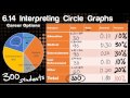
What percentage of students surveyed were interested in pursuing a career in entertainment?
Student Survey Data Analysis
Interactive Video
•

Aiden Montgomery
•
Mathematics, Education
•
5th - 8th Grade
•
5 plays
•
Hard
This video tutorial by Mr. Peterson focuses on interpreting circle graphs. It begins with an introduction to circle graphs and their use in representing data. The video then explores a survey of students' career preferences, demonstrating how to calculate the number of students in each category using percentages and decimals. It covers problem-solving techniques with circle graphs, including a state park activity survey and a class election. The tutorial also compares bar graphs and circle graphs, using examples like zoo species data to illustrate how to match data between different graph types.
Read more
10 questions
Show all answers
1.
MULTIPLE CHOICE QUESTION
30 sec • 1 pt
40%
20%
10%
30%
2.
MULTIPLE CHOICE QUESTION
30 sec • 1 pt
How many students were interested in a medical career if 300 students were surveyed?
120
90
60
30
3.
MULTIPLE CHOICE QUESTION
30 sec • 1 pt
What is the decimal equivalent of 20%?
0.02
0.2
2.0
0.002
4.
MULTIPLE CHOICE QUESTION
30 sec • 1 pt
If 30 students chose law enforcement, what is the ratio of law enforcement to the total number of students?
1:20
1:15
1:5
1:10
5.
MULTIPLE CHOICE QUESTION
30 sec • 1 pt
What is the ratio of students interested in 'other' careers to the total number of students?
1:6
1:4
1:3
1:5
6.
MULTIPLE CHOICE QUESTION
30 sec • 1 pt
If 200 visitors were surveyed, how many preferred hiking as their favorite park activity?
75
100
25
50
7.
MULTIPLE CHOICE QUESTION
30 sec • 1 pt
Which activity received the least votes in the park survey?
Hiking
Swimming
Fishing
Camping
8.
MULTIPLE CHOICE QUESTION
30 sec • 1 pt
In a class election, who received the most votes?
Juan
Ishmael
Haley
Rayma
9.
MULTIPLE CHOICE QUESTION
30 sec • 1 pt
Which circle graph best represents the election data if Rayma received the most votes?
Graph D
Graph C
Graph B
Graph A
10.
MULTIPLE CHOICE QUESTION
30 sec • 1 pt
In the zoo species data, which animal group is represented by the largest section of the circle graph?
Monkeys
Lions
Elephants
Zebras
Explore all questions with a free account
Microsoft
Apple
Others
Similar Resources on Quizizz

8 questions
Understanding Statistical Questions
Interactive video
•
6th - 7th Grade
11 questions
Data Interpretation and Analysis
Interactive video
•
5th - 8th Grade
11 questions
Understanding Graph Types and Data Representation
Interactive video
•
6th - 8th Grade
11 questions
Understanding Surveys and Data Representation
Interactive video
•
5th - 8th Grade
11 questions
Analyzing Percentages in Surveys
Interactive video
•
6th - 8th Grade
11 questions
Understanding Pie Chart Angles
Interactive video
•
5th - 8th Grade
11 questions
Analyzing Survey Results and Data
Interactive video
•
6th - 7th Grade
6 questions
Analyzing and Describing Attributes in Graphs: Line Plots, Histograms, and Box Plots
Interactive video
•
6th - 7th Grade
Popular Resources on Quizizz
17 questions
CAASPP Math Practice 3rd
Quiz
•
3rd Grade
20 questions
math review
Quiz
•
4th Grade
21 questions
6th Grade Math CAASPP Practice
Quiz
•
6th Grade
13 questions
Cinco de mayo
Interactive video
•
6th - 8th Grade
20 questions
Reading Comprehension
Quiz
•
5th Grade
20 questions
Types of Credit
Quiz
•
9th - 12th Grade
10 questions
4th Grade Math CAASPP (part 1)
Quiz
•
4th Grade
45 questions
5th Grade CAASPP Math Review
Quiz
•
5th Grade
Discover more resources for Mathematics
21 questions
6th Grade Math CAASPP Practice
Quiz
•
6th Grade
45 questions
5th Grade CAASPP Math Review
Quiz
•
5th Grade
15 questions
FAST Math Review 1
Quiz
•
5th Grade
18 questions
Math Review
Quiz
•
6th Grade
20 questions
SC READY Math Review Part 1
Quiz
•
5th Grade
20 questions
Math Review
Quiz
•
7th Grade
30 questions
5th grade math end of year review
Quiz
•
4th - 5th Grade
20 questions
One Step Equations
Quiz
•
6th Grade