Economics Summer School
Authored by T. Franky Franky
Business
11th Grade
CCSS covered
Used 13+ times

AI Actions
Add similar questions
Adjust reading levels
Convert to real-world scenario
Translate activity
More...
Content View
Student View
20 questions
Show all answers
1.
MULTIPLE CHOICE QUESTION
1 min • 1 pt

Which conclusion can be made from the data in the two graphs above?
Income changed more than unemployment did.
There were many wealthy people from 1928 to 1933.
Average income decreased as unemployment increased.
Unemployment increased the most between 1932 and 1933.
2.
MULTIPLE CHOICE QUESTION
30 sec • 1 pt

The class took a vote on their favorite sports and created a pie graph. How many total students are in the class?
24
25
10
28
3.
MULTIPLE CHOICE QUESTION
3 mins • 1 pt

Where does the majority of electrical energy come from in Oregon?
4.
MULTIPLE CHOICE QUESTION
1 min • 1 pt

What do the numbers in the vertical axis of this graph represent?
Tags
CCSS.2.MD.D.9
5.
MULTIPLE CHOICE QUESTION
45 sec • 1 pt

How many students have blue for a favorite color?
Tags
CCSS.5.G.A.2
6.
MULTIPLE CHOICE QUESTION
45 sec • 1 pt

How many people voted for popcorn and trail mix altogether?
Tags
CCSS.2.MD.D.10
7.
MULTIPLE CHOICE QUESTION
45 sec • 1 pt
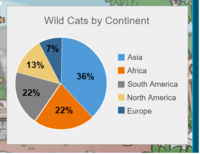
Which Continent is home to 36% of the wild cats?

Access all questions and much more by creating a free account
Create resources
Host any resource
Get auto-graded reports
Continue with Google

Continue with Email
Continue with Classlink
Continue with Clever
or continue with
Microsoft
%20(1).png)
Apple
Others
Already have an account?
