Search Header Logo
  1. Resource Library
  2. Math
  3. Data And Graphing
  4. ...
  5. Eoc Review: Scatter Plots & Correlation
EOC Review: Scatter Plots & Correlation

EOC Review: Scatter Plots & Correlation

Assessment

Presentation

Mathematics

9th - 12th Grade

Hard

CCSS
HSS.ID.B.5, 6.NS.B.3, 8.EE.B.5

+10

Standards-aligned

Created by

Amy Warner

Used 2+ times

FREE Resource

10 Slides • 35 Questions

1

media

A scatter plot is a graph that is used to show data between two variables, also known as bivariate data.

  • ​For ex: height and weight.​

Scatter plots show patterns, trends, and correlations between variables that could impact each other.​

Scatter Plots

2

​Positive Association

​Negative Association

​No Correlation

​Both variables are increasing.

One variable is increasing, the other is decreasing.​

There is no relationship between the variables.​

​Types of Correlation

media

3

Multiple Choice

Question image

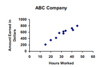
What type of correlation does this graph have?

1

positive 

2

negative

3

none

4

all of the above

4

Multiple Choice

Question image

What is the correlation?

1

Negative correlation

2

No correlation

3

Positive correlation

5

Scatter Plots can be described as linear and non-linear models. They are not perfectly linear or non-linear but they​ follow a trend.

Linear vs. Non-linear Models

media

6

Match

Match the following

Non-linear Correlation

No Correlation

Positive, Linear Correlation

Negative, Linear Correlation

7

Multiple Choice

Question image
Which scatter plot shows a linear relationship between x and y?
1

Graph A

2

Graph B

3

Graph C

4

Graph D

8

Correlation tests for a relationship between two variables. However, seeing two variables moving together does not necessarily mean we know whether one variable causes the other to occur. This is why we commonly say “correlation does not imply causation.”

media

9

Study Time and Grades

As study hours increase, grades increase. There is a positive correlation between hours and grades.


So....Do hours spent studying cause higher grades?

media

10

Ice Cream Sales and Shark Attacks

As ice cream sales increase, shark attacks increase. As ice cream sales decrease, shark attacks decrease.


So....ice cream sales cause shark attacks?

media

11

5G and COVID cases

There is a correlation between areas with 5G and high COVID cases.


So......Does 5G cause COVID?

media

12

Multiple Choice

This implies that one variable has a direct affect on the other variable.

1

Correlation

2

Causation

13

Multiple Choice

Correlation or Causation?

The number of times you come to tutoring and your test scores improving

1

Correlation

2

Causation

14

Multiple Choice

Correlation or Causation?

The inches of snowfall and the number of heart attacks

1

Correlation

2

Causation

15

​Outliers

​Clusters

​An outlier is a data point in a scatter plot that does not follow the trend of the data.

A group of data points that are closely grouped together.​

media

​outlier

cluster

16

Multiple Choice

Question image

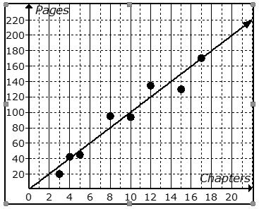
What are the coordinates of the outlier?

1

(1,9)

2

(9,1)

3

(2,2)

4

y=x

17

To show the overall trend of a data set, we can use a ​Line of Best Fit.

A line of best fit should:

  • Follow the trend of the data

  • Split the data in half

  • Help to estimate or predict values that are not already given in the set.

Line of Best Fit

media

18

Multiple Choice

Question image
Which of the following lines represents the line of best fit for the scatter plot?
1
A
2
B
3
C
4
D

19

Multiple Choice

Question image
Which of the following lines represents the line of best fit for the scatter plot?
1

A

2

B

3

C

4

D

20

Correlation coefficient (r) formulas are used to find how strong a relationship is between data. The formulas return a value between -1 and 1, where:

  • 1 indicates a strong positive relationship.

  • -1 indicates a strong negative relationship.

  • A result of zero indicates no relationship at all.

21

Multiple Choice

Question image

Estimate the correlation coefficient for this scatterplot.

1

A) r = 1.2

2

B) r = 0.89

3

C)r = 0

4

D) r = -0.89

22

Multiple Choice

Question image

Estimate the correlation coefficient for this scatterplot.

1

A) r = -0.9

2

B) r = 1

3

C) r = 0.9

4

D) r = -1

23

Multiple Choice

Average time spent listening to music per day and average time spent watching TV per day.  r=.17r=-.17  

1

strong positive

2

strong negative

3

weak positive

4

weak negative

24

Multiple Choice

Score on science exam and number of words written on the essay question.  r=.28r=.28  

1

strong positive

2

strong negative

3

weak positive

4

weak negative

25

Multiple Choice

Number of steps taken per day and number of kilometers walked per day. r=.92r=.92  

1

strong positive

2

strong negative

3

weak positive

4

weak negative

26

Multiple Choice

Question image

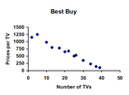
What type of correlation does this scatter plot show?

1

positive

2

negative

3

no correlation

4

nonlinear association

27

Multiple Choice

Question image

Which sentence describes the relationship shown on this scatter plot?

1

As the temperature decreases, the visitors increase.

2

As the temperature increases, the number of visitors increases.

3

As the visitors increase, the temperature decreases.

4

No correlation

28

Multiple Choice

Question image
What type of association does this graph have?
1

positive

2

negative

3

none

4

all of the above

29

Multiple Choice

Question image
What type of association does this graph have?
1

positive 

2

negative

3

none

4

all of the above

30

Multiple Choice

Question image
What represents the x axis?
1
ABC Company
2
Hours Worked
3
Amount Earned in Dollars
4
Hours in Car

31

Multiple Choice

Question image
What represents the y axis?
1
ABC Company
2
Hours Worked
3
Amount Earned in Dollars
4
Hours in Car

32

Multiple Choice

Question image
The scatter plot shows the relationship between the number of chapters and the total number of pages for several books.  Use the trend line to predict how many chapters would be in a book with 140 pages. 
1
12 chapters
2
19 chapters
3
14 chapters
4
21 chapters

33

Multiple Choice

Question image
About how many male math teachers were there in 2006?
1
15
2
30
3
35
4
45

34

Multiple Choice

What is a line of best fit used for?
1
To make predictions
2
To make the graph look pretty
3
To connect the points
4
To make it look like you know what you are doing

35

Multiple Choice

Question image
As the age of the car increases, its value decreases. Which scatterplot represents this relationship?
1
A
2
B
3
C
4
D

36

Multiple Choice

Question image
Which of the following lines represents the line of best fit for the scatter plot?
1
A
2
B
3
C
4
D

37

Multiple Choice

Question image
Based on the graph, if Joe earned $400, how many hours did he work?
1
25 hours
2
35 hours
3
45 hours
4
15 hours

38

Multiple Choice

Question image

Which graph has no association?

1

A

2

B

3

C

4

D

39

Multiple Choice

Question image

Which graph has a positive association?

1

A

2

B

3

C

4

D

40

Multiple Select

Question image

Which graphs has a negative association?

1

A

2

B

3

C

4

D

41

Drag and Drop

Question image
1.  Mrs. Collins made a scatterplot to show the relationship between the number of absences and a student’s final exam score. Based on this scatterplot, a student with 6 absences should get approximately what score on the final exam? 
Drag these tiles and drop them in the correct blank above
65
92
70
76

42

Drag and Drop

Question image
Choose the graph with a trend line that best fits the data.
Drag these tiles and drop them in the correct blank above
graph 1
graph 2
graph 3
graph 4

43

Multiple Choice

Question image
The following scatter plot shows Pam's training as she prepares to run a 6 mile race at the end of the month.  Which of the following would be a reasonable approximation for the length of time it would take for her to run 6 miles? 
1
A. 50 min
2
B. 80 min
3
C. 45 min
4
D. 60 min

44

Multiple Choice

Question image

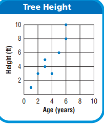
What is the age of the tree that is 8 feet tall?

1

6 Years

2

7 Years

3

8 Years

4

9 Years

45

Multiple Choice

Question image
What is the correlation between length of running start and distance of jump?
1
positive:  the further you run the further you jump
2
negative: the less you run the less distance of your jump
3
positive: the further your running start the less your distance
media

A scatter plot is a graph that is used to show data between two variables, also known as bivariate data.

  • ​For ex: height and weight.​

Scatter plots show patterns, trends, and correlations between variables that could impact each other.​

Scatter Plots

Show answer

Auto Play

Slide 1 / 45

SLIDE