Search Header Logo
Box Plots and Dot Plots

Box Plots and Dot Plots

Assessment

Presentation

Mathematics

6th - 8th Grade

Easy

7.4.1.1, 6.13.A

Standards-aligned

Created by

Maria Grillias

Used 2+ times

FREE Resource

7 Slides • 44 Questions

1

Box Plots

media
media

2

Box Plots/Box and Whiskers

It is another way to represent data.  We have already used Dot Plots and Histograms to represent data.  Box Plots are an easy way to show if a number is above the middle of data or below the middle of data.

media

3

5 Number Summary

We use the 5 number Summary (5 special data number) to create and help interpret data from a box plot.  The 5 number summary includes:  Minimum, Maximum, (Q1) Quartile 1 or Lower Quartile, (Q2) Median, and (Q3) Quartile or Upper Quartile.

media

4

Parts of a Box Plot

  • Min – Minimum: Smallest number of the Data Set

  • Q1 – Lower QuartileThe median of the lower half of the data

  • Q2 – Median:   Middle number of the set of data

  • Q3 – Upper Quartile:  The median of the upper half of the data

  • Max – Maximum:  Largest number in the data set

  • Interquartile Range (IQR): Q3 – Q1

media

5

Median

  • Divides the data set into two halves

  • 50% of the data numbers are below this number

  • 50% of the data numbers are above this number

6

Quartiles

  • Quartiles divide the data set into four equal parts.

  • 25% each

7

Fill in the Blank

Question image

What is the maximum (largest number) of this Box Plot?

8

Fill in the Blank

Question image

What is the minimum (smallest number) of this Box Plot?

9

Fill in the Blank

Question image

What is the lower quartile (Q1) of this Box Plot?

10

Multiple Choice

Question image

What is the Median (Q2) of this Box Plot?

1

80

2

82

3

81.5

11

Fill in the Blank

Question image

What is the Upper Quartile (Q3) of this Box Plot?

12

Multiple Choice

Question image

Find the Interquartile Range (range of the "box") for this Box Plot. (Hint: Q3 - Q1)

1

92 - 77 = 15

2

77 - 92 = -15

3

92 + 77 = 169

4

92 - 77 = 25

13

Fill in the Blank

Question image

Given the Box Plot: Identify the Minimum

14

Fill in the Blank

Question image

Given the Box Plot: Identify the Maximum

15

Multiple Choice

Question image

Given the Box Plot: Identify the Lower Quartile.

1

33.5

2

33

3

34

4

34.5

16

Draw

Students in Mrs. Hankins' Algebra class received the following scores on a test:

37 42 48 51 52 53 54 54 55

Find the 5 number summary and create a box and whisker plot for the data.

17

Fill in the Blank

Question image

What is the median amount of homework assignments for class 2?

18

Multiple Choice

What is a graphic way of showing a summary of data using the median, quartiles, and extremes of the data?
1

A. Stem-and-Leaf Plot

2

B. Bar Graph

3

C. Box Plot

4

D. Pie Chart

19

Multiple Choice

Which of the following lists all parts of the five number summary?
1

A. Mean, Median, Mode, Range, and Total

2

B. Lower Extreme, Lower Quartile, Median, Upper Quartile, and Upper Extreme 

3

C. Smallest, Q1, Q2, Q3, and Q4

4

D. Lower Quartile, Upper Quartile, Range, Mean, and Median

20

Multiple Choice

What is a the meaning for "median"?
1

A. fair share

2

B. middle

3

C. repeats the most

4

D. variation

21

Match

Match the following terms with their definitions

Minimum (Min)

First Quartile (Q1)

Median (Q2)

Third Quartile (Q3)

Maximum (Max)

The lowest value of the data set

Middle of the lower half of the data set. 25% of the data lies below this value and 75% lies above.

Middle of the data set. Half the data (50%) lies below this value and half (50%) lies above.

Middle of the upper half of the data set. 75% of the data lies below this value and 25% lies below.

The highest value of the data set

22

Match

Match the following visuals with their appropriate name?

Boxplot

Histogram

Dotplot

23

Fill in the Blank

Question image

What is the range of homework assignments for class 2?

24

Fill in the Blank

Question image

What is the IQR for class 1?

25

Multiple Choice

Question image
Which interval has 4 students?
1

56-59

2

60-63

3

60-67

4

48-51

26

Multiple Choice

Question image

Which histogram matches the data set?

1
2
3
4

27

Multiple Choice

Question image

What do points B and D represent on the box plot?

1

Mean and Mode

2

Mean and Median

3

Least and Greatest Value

4

First and Third Quartiles

28

Multiple Choice

Question image

Which of the following is represented by the histogram?

1

Of the 20 riders represented in the graph, over 50% are 30 years of age or older.

2

One fourth of the riders represented in the graph are younger than 40 years old.

3

Half the riders represented in the graph are between the ages 10-29.

4

Six percent of the riders represented in the graph are between the ages 10 and 19.

29

Multiple Choice

Question image
Which restaurant has a higher median wait time?
1
Lucy's Steakhouse
2
Gary's Grill
3
They are the same

30

Multiple Choice

Question image

Which car has the biggest maximum jump?

1

Car A

2

Car B

31

Multiple Choice

Question image

Which has a greater interquartile range?

1

Airplane A

2

Airplane B

3

Both the same

32

Multiple Choice

Question image

Which statement is true?

1

Airplane A has a lesser median

2

Airplane B has a greater range

3

Airplane A has a less predictable flight length

4

Airplane B a lesser IQR

33

Multiple Choice

Question image

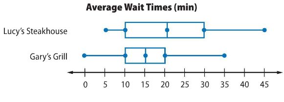
Based on the information in the double Box Plot which of the following is true?

1

The range of the data for Fun Fit is less than the range of the data for Greg’s Gym.

2

The median for Greg’s Gym is less than the median for Fun Fit.

3

The minimum attendance for Fun Fit is less than the minimum attendance for Greg’s Gym.

4

The interquartile range for Greg’s Gym is greater than the interquartile range for Fun Fit.

34

Multiple Choice

Question image

What percentage of Group A earns between $1100 and $1400?

1

25%

2

50%

3

75%

4

100%

35

Multiple Choice

Question image

Which statement is true about Group A and B's earnings?

1

Group A earned more overall than Group B.

2

Group B's lower quartile is equal to Group A's median.

3

100% of Group B's earnings were more than 25% of Group A's.

4

Both groups earned at most $2000.

36

Multiple Choice

Question image

Which of the following statements is best supported by the Box Plots?

1

The minimum temperature for Reybold is lower than the minimum temperature for Picktown.

2

The median for Reybold and Picktown are equal.

3

The first quartile for Reybold is greater than the first quartile for Picktown.

4

Picktown has a greater interquartile range than Reybold.

37

Multiple Choice

You want to retake two quizzes out of the five you have taken this semester.

Your scores on the other three were 86, 92, and 95. You want the mean to be 93. The range ends up being 12. What are possible scores to satisfy these conditions?

1

94, 98

2

92, 100

3

90, 98

4

94, 96

38

Reorder

Matthew conducts a survey for which he collects people’s ages. The results of Matthew’s survey are shown.

    • Group 1: 40 30 20     35

• Group 2: 24 32 26 45    

 • Group 3: 20 36 36 30 36

Order the groups based on their mean.

Group 1

Group 3

Group 2

1
2
3

39

Fill in the Blank

Which two values would give this data set a mean of 86, a median of 84, and a range of 18?

80, 82, ___, 86, ___

(enter them least to greatest)

,

40

Multiple Choice

Question image

If 200 people were surveyed, approximately how many people like pepperoni and cheese as their topping?

1

100 people

2

150 people

3

50 people

4

75%

41

Multiple Choice

Question image

Mary is recording her plant's growth in a journal. How many inches has the plant grown from week 1 to 7?

1

22

2

18

3

14

42

Multiple Choice

Each day, Erin chooses shirts to wear from her closet at random. She has 2 blue shirts, 2 white shirts, 5 back shirts, and 3 red shirts. Since she does not replace the shirts she has worn, what is the probability that she will wear 2 black shirts in a row?

1

116\frac{1}{16}

2

533\frac{5}{33}

3

9132\frac{9}{132}

4

25132\frac{25}{132}

43

Multiple Choice

There are 200 students in the band. The band director conducted a random survey of 25 of the band members to determine their favorite flavor of cupcake for their next party. The results are shown below.

- 9 students want chocolate

- 11 students want vanilla

- 5 students want strawberry

Based on the survey, which of these is the best prediction of the cupcakes wanted by the 200 band members?

1

There are 16 students who want strawberry or vanilla.

2

There are 16 more students who want vanilla than chocolate.

3

There are 48 more students who want strawberry than vanilla.

4

There are 128 students who want strawberry or chocolate.

44

Multiple Choice

Question image
How many students had more than 6 candy bars?
1
5
2
2
3
3
4
1

45

Multiple Choice

Question image
1

A

2

B

3

C

4

D

46

media

47

Multiple Choice

Question image

Based on the plots, which company had greater variation?

1

Company A

2

Company B

3

Company C

4

They have the same

48

Multiple Choice

Question image

How many students read no books (zero) last summer?

1

6

2

1

3

4

4

3

49

Multiple Choice

Question image

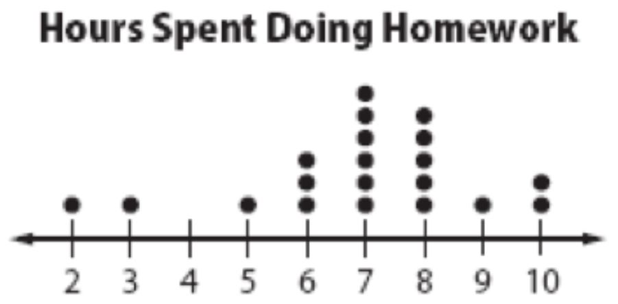
What is the greatest amount of time a student spent doing his homework?

1

2 hours

2

1 hour

3

6 hours

4

10 hours

50

Multiple Choice

Question image
1
2
3
4

51

Dropdown

Question image
The peak score is: ​

Box Plots

media
media

Show answer

Auto Play

Slide 1 / 51

SLIDE