
Scatter Plots & Trend Lines ext
Presentation
•
Mathematics
•
6th - 12th Grade
•
Easy

Meagan Lumley
Used 1+ times
FREE Resource
8 Slides • 55 Questions
1
2

3

4

5


6


7
Multiple Choice

8
Multiple Choice

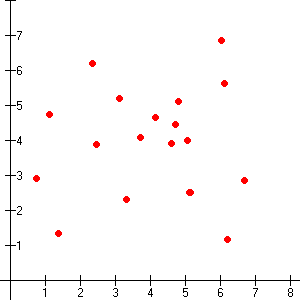
Describe the association for the graph.
9
Multiple Choice

The association value for this graph will indicate a
10
Multiple Choice

Describe the correlation in the graph shown.
11
Multiple Choice

Describe the association for the graph.
12
Multiple Choice

Describe the Association for the graph.
13
Multiple Choice

Describe the association for the graph.
14
Multiple Choice
15
Multiple Choice

Which best describes the form of this scatterplot?
16
Multiple Choice

Describe the association of the scatter plot.
17

18
Multiple Choice
19
Multiple Choice
20
Multiple Choice
21
Multiple Choice
22
Multiple Choice
23
Multiple Choice

Describe the relationship between the variables.
24
Multiple Choice

Describe the correlation in the graph shown.
25
Multiple Choice

Describe the correlation:
26
Multiple Choice

Describe the correlation:
27
Multiple Choice

Describe the correlation:
28

29
Multiple Choice

30
Multiple Choice

31
Drag and Drop

32
Multiple Choice
33
Dropdown

34
Drag and Drop
35
Dropdown

36
Drag and Drop
37
Dropdown

38
Dropdown

39
Multiple Choice

40
Multiple Choice

41
Multiple Choice

42
Multiple Choice
43
Multiple Choice
44
Multiple Choice

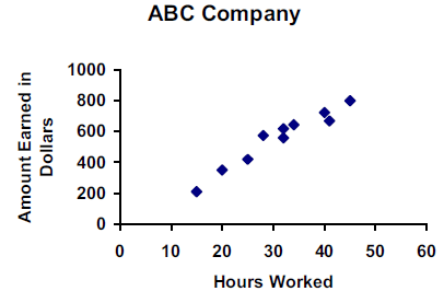
What ordered pairs would you use to find the slope for the trend line?
45
Multiple Choice

46
Multiple Choice
47
Multiple Choice
48
Multiple Choice
49
Multiple Choice

50
Multiple Choice
51
Multiple Choice
52
Multiple Choice
53
Multiple Choice
54
Multiple Choice
55
Multiple Choice
56
Multiple Select

Select ALL the terms that describe the association of the data graphed in the scatter plot.
57
Multiple Choice
Are there any clusters in this scatter plot?
58
Multiple Choice
Would you describe this association as strong or weak?
59
Multiple Choice

Hint: create the trend line first
60
Multiple Choice
61
Multiple Choice
If four additional players are added to the data set, which of the new points would be an outlier?
62
Multiple Choice

63
Multiple Choice

Show answer
Auto Play
Slide 1 / 63
SLIDE
Similar Resources on Wayground

58 questions
Trigonometric Functions
Lesson
•
KG - University
61 questions
LIGHT
Lesson
•
KG
57 questions
Presentación sin título
Lesson
•
KG - University
57 questions
numbers
Lesson
•
KG
54 questions
4TH QUARTER_MATHEMATICS (KINDER 2)
Lesson
•
KG
59 questions
Geometry and Polygons
Lesson
•
7th Grade - University
55 questions
WH1.6 Rise of the Roman Republic
Lesson
•
6th - 12th Grade
59 questions
Famous African Americans
Lesson
•
KG - 12th Grade
Popular Resources on Wayground
15 questions
Fractions on a Number Line
Quiz
•
3rd Grade
10 questions
Probability Practice
Quiz
•
4th Grade
15 questions
Probability on Number LIne
Quiz
•
4th Grade
20 questions
Equivalent Fractions
Quiz
•
3rd Grade
25 questions
Multiplication Facts
Quiz
•
5th Grade
22 questions
fractions
Quiz
•
3rd Grade
6 questions
Appropriate Chromebook Usage
Lesson
•
7th Grade
10 questions
Greek Bases tele and phon
Quiz
•
6th - 8th Grade
Discover more resources for Mathematics
20 questions
Writing Algebraic Expressions
Quiz
•
6th Grade
20 questions
Ratios/Rates and Unit Rates
Quiz
•
6th Grade
14 questions
Volume of rectangular prisms
Quiz
•
7th Grade
23 questions
TSI Math Vocabulary
Quiz
•
10th - 12th Grade
15 questions
Graphing Inequalities
Quiz
•
7th - 9th Grade
20 questions
Graphing Inequalities on a Number Line
Quiz
•
6th - 9th Grade
20 questions
One Step Equations
Quiz
•
6th Grade
12 questions
One-Step Equations
Quiz
•
6th Grade