- Resource Library
- Math
- Probability And Statistics
- Correlation And Coefficients
- 11/12 Scatterplots And Correlations

11/12 Scatterplots and Correlations
Presentation
•
Mathematics
•
8th - 9th Grade
•
Practice Problem
•
Medium
+2
Standards-aligned

Thomas G Rizo
Used 39+ times
FREE Resource
9 Slides • 18 Questions
1

2
3

4
Multiple Choice
5
Multiple Choice

What type of correlation does this scatterplot represent?
6
Multiple Choice

What type of correlation does this scatterplot represent?
7
Multiple Choice

What type of correlation does this scatterplot represent?
8
Multiple Choice

What kind of correlation does this scatterplot show?
9
Multiple Choice

Is this a positive, negative, or no relationship?
10

11
Multiple Choice
Estimate the Correlation Coefficient.
12
Multiple Choice

Which of the following is the best approximation of the rvalue for the above graph?
13
Multiple Choice
Estimate the correlation coefficient for this scatterplot.
14
Multiple Choice
Estimate the correlation coefficient for this scatterplot.
15
Multiple Choice

Approximate the correlation of the scatter plot.
16
17

18

19

20

21
Multiple Choice

22
Multiple Choice

The manager of a restaurant recorded how many people were in different groups of customers and how much those groups spent on food and beverages. The scatter plot shows the data she recorded.
Based on this scatter plot, about how much money would a group of 10 people be expected to spend on food and beverages at this restaurant?
23
Multiple Choice

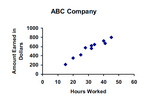
Joe works at the ABC Company. The scatter plot shows the number of hours Joe worked and the amount he earned over a span of several pay periods.
Based on the graph, what is the best prediction of the amount Joe would earn if he works 55 hours?
24
Multiple Choice

25
Multiple Choice

If the carpenter worked for 6 days, what would be the best prediction of his earnings?
26
Multiple Choice

Which graph shows an accurate trend line for the scatter plot?
27
Multiple Choice

Show answer
Auto Play
Slide 1 / 27
SLIDE
Similar Resources on Wayground

21 questions
Best Method: Solving Systems of Equations
Lesson
•
7th - 10th Grade
22 questions
Function vs. Not a Function
Lesson
•
8th - 9th Grade
21 questions
Analyzing Graphs
Lesson
•
8th - 9th Grade
19 questions
Quadratic Transformations
Lesson
•
8th - 9th Grade
20 questions
Add, Subtract, Multiply Polynomials
Lesson
•
9th Grade
20 questions
Similar vs Congruent - Day 2 Lesson
Lesson
•
8th Grade
20 questions
Angle Basics and Angle Relationships
Lesson
•
8th - 10th Grade
20 questions
Arithmetic Sequences
Lesson
•
8th - 9th Grade
Popular Resources on Wayground
15 questions
Fractions on a Number Line
Quiz
•
3rd Grade
20 questions
Equivalent Fractions
Quiz
•
3rd Grade
25 questions
Multiplication Facts
Quiz
•
5th Grade
29 questions
Alg. 1 Section 5.1 Coordinate Plane
Quiz
•
9th Grade
22 questions
fractions
Quiz
•
3rd Grade
11 questions
FOREST Effective communication
Lesson
•
KG
20 questions
Main Idea and Details
Quiz
•
5th Grade
20 questions
Context Clues
Quiz
•
6th Grade
Discover more resources for Mathematics
29 questions
Alg. 1 Section 5.1 Coordinate Plane
Quiz
•
9th Grade
14 questions
finding slope from a graph
Quiz
•
8th Grade
20 questions
Graphing Inequalities on a Number Line
Quiz
•
6th - 9th Grade
8 questions
8th U6L1: Organizing Data
Quiz
•
8th Grade
20 questions
Slope from a Graph
Quiz
•
8th Grade
12 questions
8th U5 Test Review: Functions & Volume
Quiz
•
8th Grade
20 questions
Slope Intercept Form
Quiz
•
7th - 8th Grade
20 questions
Box and Whisker Plots
Quiz
•
9th Grade